Scenario
Scenario
Currently, there is a high rate of turnover among employees. ( both employees who quit and employees who are fired).
Salifort strives to create a corporate culture that supports employee success and professional development. Further, the high turnover rate is costly $$$ in the financial sense.
Objectives:
- Predict whether an employee will leave the company.
- Discover the reasons behind their departure.
- Understand the problem better.
- Develop a solution.
Steps:
- Human Resources to survey a sample of employees
- Understand the business scenario and define the problem Plan
- Data exploration and data cleaning Plan, Analyze
- Determine which models are most appropriate Analyze, Construct
- Construct the model
Results:
Conclusions
1. Key Factors Influencing Employee Turnover:
-
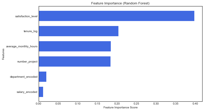
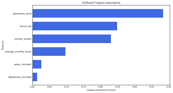
Satisfaction Level is the strongest predictor of employee retention (as seen in both XGBoost and Random Forest feature importance graphs).
-
Tenure, Number of Projects, and Average Monthly Hours also have a significant influence.
-
Salary and Department have much lower predictive power, suggesting that dissatisfaction and workload impact retention more than compensation.
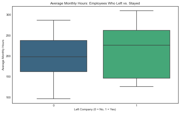
2. High Workload and Potential Burnout:
-
The average monthly work hours is 201 hours, which is 50+ hours per week, 20% above the standard 40-hour workweek.
-
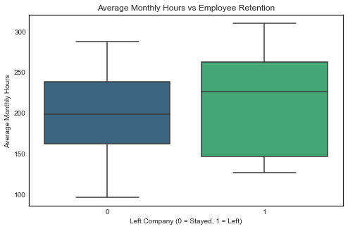
Employees who left tend to have higher monthly working hours compared to those who stayed.
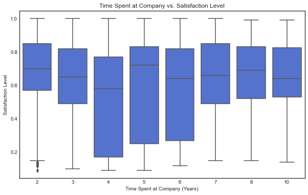
3. Short Employee Lifespan:
- Employees stay for an average of only 3 years, with 75% leaving before reaching 4 years.
- Satisfaction levels are highly variable across tenure, indicating potential retention issues in the early years.
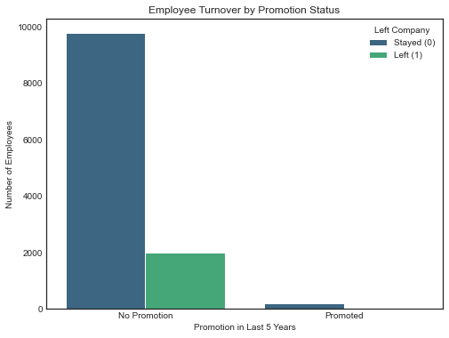
4. Lack of Promotions:
Only 1.7% of employees (203 out of 11,991) received a promotion in the last 5 years. This extreme imbalance makes the variable unsuitable for predicting employee turnover in the model. However, the insight remains valuable, as promotions are generally associated with employee satisfaction and retention. The low promotion rate may contribute to turnover trends and should be explored further.
5. Model Performance:
-
Both Random Forest and XGBoost models performed exceptionally well, with XGBoost achieving an AUC of 0.985 and Random Forest an AUC of 0.979.
-
Both models have high precision and recall, making them effective for predicting turnover.
Classification Metrics
| Model | Accuracy | Precision | Recall | F1-score | AUC |
|---|---|---|---|---|---|
| Random Forest | 0.985 | 0.976 | 0.930 | 0.952 | 0.979 |
| XGBoost | 0.980 | 0.980 | 0.960 | 0.970 | 0.985 |
*Macro Average
XGBoost Class-wise Metrics
| Class | Precision | Recall | F1-score | Support |
|---|---|---|---|---|
| 0 | 0.99 | 1.00 | 0.99 | 2001 |
| 1 | 0.97 | 0.93 | 0.95 | 398 |
Random Forest Cross-Validation AUC Scores
| Fold | AUC Score |
|---|---|
| 1 | 0.9808 |
| 2 | 0.9766 |
| 3 | 0.9700 |
| 4 | 0.9815 |
| 5 | 0.9794 |
Mean AUC: 0.978
Recommendations
1. Improve Employee Satisfaction:
-
Conduct regular employee engagement surveys to understand dissatisfaction.
-
Implement flexible working arrangements (work-from-home options, mental health support, better workload distribution).
-
Introduce non-monetary benefits such as skill-building programs, better career progression paths, and team-building activities.
2. Reduce Overwork & Burnout:
-
Identify departments or teams with excessive workloads and redistribute tasks.
-
Set upper limits on overtime hours and encourage work-life balance through company policies.
3. Increase Promotions & Career Growth:
- Improve internal mobility programs to help employees grow within the company.
- Offer clear promotion criteria and more frequent performance reviews.
- Introduce mentorship programs to retain talent by providing career guidance.
4. Refine Employee Retention Strategies Based on Tenure:
- Employees leaving before 3 years need targeted retention efforts.
- Create structured onboarding and mentorship programs to improve early engagement.
- Offer retention bonuses or tailored development programs for employees nearing the 2-year mark.
5. Leverage Both Models (Random Forest & XGBoost):
- Use Random Forest for feature interpretability
- Use XGBoost for making high-accuracy predictions when identifying high-risk employees.
Next Steps
1. Deploy the Model in Production:
-
Integrate the XGBoost classifier into HR systems to flag at-risk employees.
-
Provide HR with a dashboard to visualize key risk factors.
2. Run an Employee Retention Experiment:
- Pilot a work-life balance initiative (reduced overtime, flexible hours) and measure the impact on retention.
- Offer early-career retention incentives (bonuses, career coaching) to see if it improves tenure beyond 2-3 years.
3. Gather Additional data to answer questions that emerged from the analysis:
- Are promotions or lack of promotions an important factor for employees satisfaction rates?
- Are employees feeling overworked, or burned? compared to other employees and the 40-hour work week traditional in the job market?
Data Analysis in Python & Model Building.
# For data manipulation
import pandas as pd
import numpy as np

#For data Visualization
import seaborn as sns
import matplotlib.pyplot as plt
plt.style.use('seaborn-white')  # Ensures a white background for the plots
sns.set_style("white")

pd.set_option('display.max_columns', None)

#For model Selection

from sklearn.model_selection import train_test_split
from sklearn.ensemble import RandomForestClassifier
from sklearn.model_selection import cross_val_score

# Convert categorical variables to dummy variables

from sklearn.preprocessing import OrdinalEncoder

# Importing the metrics & models
from sklearn.metrics import accuracy_score, precision_score, recall_score, f1_score, roc_auc_score
from sklearn.linear_model import LogisticRegression
from sklearn.pipeline import Pipeline
from sklearn.preprocessing import StandardScaler

from xgboost import XGBClassifier
import xgboost as xgb
from sklearn.metrics import classification_report, roc_auc_score
#import data
df0 = pd.read_csv('/Users/user/Capstone_Project_Salifort_Motors/Files/HR_capstone_dataset.csv')
df0
| satisfaction_level | last_evaluation | number_project | average_montly_hours | time_spend_company | Work_accident | left | promotion_last_5years | Department | salary | |
|---|---|---|---|---|---|---|---|---|---|---|
| 0 | 0.38 | 0.53 | 2 | 157 | 3 | 0 | 1 | 0 | sales | low |
| 1 | 0.80 | 0.86 | 5 | 262 | 6 | 0 | 1 | 0 | sales | medium |
| 2 | 0.11 | 0.88 | 7 | 272 | 4 | 0 | 1 | 0 | sales | medium |
| 3 | 0.72 | 0.87 | 5 | 223 | 5 | 0 | 1 | 0 | sales | low |
| 4 | 0.37 | 0.52 | 2 | 159 | 3 | 0 | 1 | 0 | sales | low |
| ... | ... | ... | ... | ... | ... | ... | ... | ... | ... | ... |
| 14994 | 0.40 | 0.57 | 2 | 151 | 3 | 0 | 1 | 0 | support | low |
| 14995 | 0.37 | 0.48 | 2 | 160 | 3 | 0 | 1 | 0 | support | low |
| 14996 | 0.37 | 0.53 | 2 | 143 | 3 | 0 | 1 | 0 | support | low |
| 14997 | 0.11 | 0.96 | 6 | 280 | 4 | 0 | 1 | 0 | support | low |
| 14998 | 0.37 | 0.52 | 2 | 158 | 3 | 0 | 1 | 0 | support | low |
14999 rows × 10 columns
#Having the description of variables in the dataset for better understanding.
description = pd.read_csv('/Users/user/Capstone_Project_Salifort_Motors/Files/Variable_Description.csv')
description
| Variable | Description | |
|---|---|---|
| 0 | satisfaction_level | Employee-reported job satisfaction level [0–1] |
| 1 | last_evaluation | Score of employee's last performance review [0–1] |
| 2 | number_project | Number of projects employee contributes to |
| 3 | average_monthly_hours | Average number of hours employee worked per month |
| 4 | time_spend_company | How long the employee has been with the compan... |
| 5 | Work_accident | Whether or not the employee experienced an acc... |
| 6 | left | Whether or not the employee left the company |
| 7 | promotion_last_5years | Whether or not the employee was promoted in th... |
| 8 | Department | The employee's department |
| 9 | salary | The employee's salary (U.S. dollars) |
Data Overview
- There are no missing values in the dataset.
- Only department and salary have non-numeric data types.
- These categorical features might need to be converted to binary using one-hot encoding
if they are used for prediction and the model requires or benefits from numerical input.
#Checking for missing values, and Data types.
df0.info()
<class 'pandas.core.frame.DataFrame'>
RangeIndex: 14999 entries, 0 to 14998
Data columns (total 10 columns):
 #   Column                 Non-Null Count  Dtype
---  ------                 --------------  -----
 0   satisfaction_level     14999 non-null  float64
 1   last_evaluation        14999 non-null  float64
 2   number_project         14999 non-null  int64
 3   average_montly_hours   14999 non-null  int64
 4   time_spend_company     14999 non-null  int64
 5   Work_accident          14999 non-null  int64
 6   left                   14999 non-null  int64
 7   promotion_last_5years  14999 non-null  int64
 8   Department             14999 non-null  object
 9   salary                 14999 non-null  object
dtypes: float64(2), int64(6), object(2)
memory usage: 1.1+ MB
#Checking for duplicates and removing them.

duplicates = df0.duplicated().sum()
print('number of duplicated rows' ,duplicates)
df0 = df0.drop_duplicates(keep='first')
df0.info()
number of duplicated rows 3008
<class 'pandas.core.frame.DataFrame'>
Int64Index: 11991 entries, 0 to 11999
Data columns (total 10 columns):
 #   Column                 Non-Null Count  Dtype
---  ------                 --------------  -----
 0   satisfaction_level     11991 non-null  float64
 1   last_evaluation        11991 non-null  float64
 2   number_project         11991 non-null  int64
 3   average_montly_hours   11991 non-null  int64
 4   time_spend_company     11991 non-null  int64
 5   Work_accident          11991 non-null  int64
 6   left                   11991 non-null  int64
 7   promotion_last_5years  11991 non-null  int64
 8   Department             11991 non-null  object
 9   salary                 11991 non-null  object
dtypes: float64(2), int64(6), object(2)
memory usage: 1.0+ MB
Notes on describe()
-
Average monthly hours is very high, it has a mean of 201 hours monthly, that means 50 hours a week which is 20% more than the traditional 40 hour work week and at the lowest percentile 25% is barely below that number.
-
Standard deviation is close to 50 Hours,
Are some employees being overworked, burned? compared to other employees and the 40 hour work week traditional in the job market? -
Employees spent average of 2 years in the company Min 1.4 years, max 10 years. the 25% percentile is 3 years.
Benchmarking:
-
How does this compare with other companies in the same industry?
-
How does this compare based on department? e.g sales roles normally have lower rettention rates compared to other roles.
-
promotion_last_5years has a mean of 0.021, meaning only 2.1% of employees got a promotion in the last 5 years, this could contribute to dissatisfaction.
Cross-checking satisfaction levels vs. attrition could show interesting insight.
df0.describe()
| satisfaction_level | last_evaluation | number_project | average_montly_hours | time_spend_company | Work_accident | left | promotion_last_5years | |
|---|---|---|---|---|---|---|---|---|
| count | 11991.000000 | 11991.000000 | 11991.000000 | 11991.000000 | 11991.000000 | 11991.000000 | 11991.000000 | 11991.000000 |
| mean | 0.629658 | 0.716683 | 3.802852 | 200.473522 | 3.364857 | 0.154282 | 0.166041 | 0.016929 |
| std | 0.241070 | 0.168343 | 1.163238 | 48.727813 | 1.330240 | 0.361234 | 0.372133 | 0.129012 |
| min | 0.090000 | 0.360000 | 2.000000 | 96.000000 | 2.000000 | 0.000000 | 0.000000 | 0.000000 |
| 25% | 0.480000 | 0.570000 | 3.000000 | 157.000000 | 3.000000 | 0.000000 | 0.000000 | 0.000000 |
| 50% | 0.660000 | 0.720000 | 4.000000 | 200.000000 | 3.000000 | 0.000000 | 0.000000 | 0.000000 |
| 75% | 0.820000 | 0.860000 | 5.000000 | 243.000000 | 4.000000 | 0.000000 | 0.000000 | 0.000000 |
| max | 1.000000 | 1.000000 | 7.000000 | 310.000000 | 10.000000 | 1.000000 | 1.000000 | 1.000000 |
Visualizing patterns
Note!
There is a noticeable drop at 4 years. Then an huge increase at 5 years.
-
What are the posible explanations for this?
-
is this the time where most people are feeling overworked but have not seen a raise?
-
is the work-charge/pay balance very high for the employees with less tenure?
-
promotion_last_5years has a mean of 0.021, meaning only 2.1% of employees got a promotion in the last 5 years, this could contribute to dissatisfaction.
plt.figure(figsize=(10, 6))
sns.boxplot(x='time_spend_company', y='satisfaction_level', data=df0, color="royalblue")
plt.title('Time Spent at Company vs. Satisfaction Level')
plt.xlabel('Time Spent at Company (Years)')
plt.ylabel('Satisfaction Level')
plt.show()
Analysis of turnover
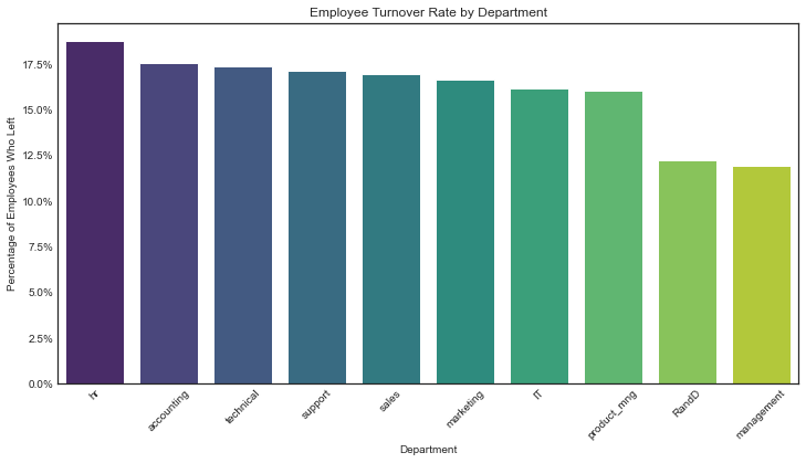
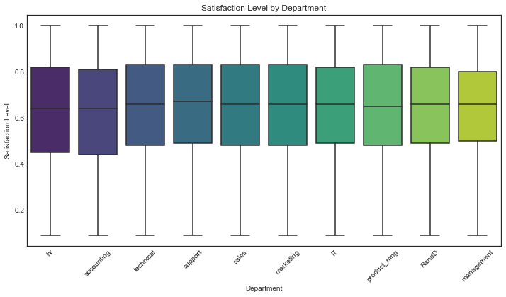
Note!
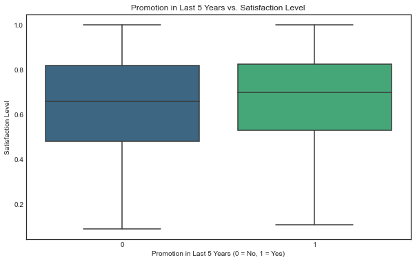
In contrast with the chart Employee turnover % by Department, surveys of employee satisfaction do not appear to show a noticeable difference across the different departments
Also there is only a small difference in reported satisfaction between employees who got a promotion and employees who did not.
Are employee satisfaction surveys a good measure for satisfaction when it doesn’t reflect the differences in turnover rate?
# Calculate percentage of employees who left per department
dept_retention = df0.groupby('Department')['left'].mean().reset_index()

# Sort by highest turnover rate
dept_retention = dept_retention.sort_values(by='left', ascending=False)

# Create a color gradient from red (high turnover) to blue (low turnover)
colors = sns.color_palette("coolwarm", len(dept_retention))
colors.reverse()  # Make highest turnover red and lowest blue

plt.figure(figsize=(12, 6))
sns.barplot(data=dept_retention, x='Department', y='left', palette='viridis')

plt.title('Employee Turnover Rate by Department')
plt.xlabel('Department')
plt.ylabel('Percentage of Employees Who Left')
plt.xticks(rotation=45)
plt.gca().yaxis.set_major_formatter(plt.matplotlib.ticker.PercentFormatter(1))  # Convert to percentage format
plt.show()


dept_order = dept_retention['Department']

plt.figure(figsize=(12, 6))
sns.boxplot(data=df0, x='Department', y='satisfaction_level', palette='viridis', order=dept_order)

plt.title('Satisfaction Level by Department')
plt.xlabel('Department')
plt.ylabel('Satisfaction Level')
plt.xticks(rotation=45)
plt.show()

plt.figure(figsize=(10, 6))
sns.boxplot(x='left', y='average_montly_hours', data=df0, palette='viridis')
plt.title('Average Monthly Hours: Employees Who Left vs. Stayed')
plt.xlabel('Left Company (0 = No, 1 = Yes)')
plt.ylabel('Average Monthly Hours')
plt.show()
Promotion Analysis
This chart shows that the promotions variable is unbalanced with only 2,17% of datapoints being promoted in the last 5 years, therefore despite the impresion of showing a correlation between promotions and retention, is not a good reference for prediction
plt.figure(figsize=(8, 6))
sns.countplot(data=df0, x='promotion_last_5years', hue='left', palette='viridis')

plt.title('Employee Turnover by Promotion Status')
plt.xlabel('Promotion in Last 5 Years')
plt.ylabel('Number of Employees')
plt.xticks(ticks=[0, 1], labels=['No Promotion', 'Promoted'])
plt.legend(title='Left Company', labels=['Stayed (0)', 'Left (1)'])
plt.show()

plt.figure(figsize=(10, 6))
sns.boxplot(x='promotion_last_5years', y='satisfaction_level', data=df0,  palette='viridis')
plt.title('Promotion in Last 5 Years vs. Satisfaction Level')
plt.xlabel('Promotion in Last 5 Years (0 = No, 1 = Yes)')
plt.ylabel('Satisfaction Level')
plt.show()

# Count of employees in each promotion category
promotion_counts = df0['promotion_last_5years'].value_counts()

# Percentage of employees who stayed vs. left in each category
promotion_left_percent = df0.groupby('promotion_last_5years')['left'].value_counts(normalize=True).unstack() * 100

# Print both
print("Employee Count by Promotion in Last 5 Years:")
print(promotion_counts, "\n")

print("Percentage of Employees Who Stayed vs. Left:")
print(promotion_left_percent)
Employee Count by Promotion in Last 5 Years:
0    11788
1      203
Name: promotion_last_5years, dtype: int64

Percentage of Employees Who Stayed vs. Left:
left                           0          1
promotion_last_5years
0                      83.177808  16.822192
1                      96.059113   3.940887
#Renaming columns to match the course program requirements.
df1 = df0.rename(columns={'Work_accident': 'work_accident',
                          'average_montly_hours': 'average_monthly_hours',
                          'time_spend_company': 'tenure',
                          'Department': 'department'})
df1.columns
Index(['satisfaction_level', 'last_evaluation', 'number_project',
       'average_monthly_hours', 'tenure', 'work_accident', 'left',
       'promotion_last_5years', 'department', 'salary'],
      dtype='object')
# Count of employees who left vs. stayed
retention_counts = df1['left'].value_counts()

# Convert to percentage
retention_percentages = df1['left'].value_counts(normalize=True) * 100

# Display results
print("Employee Retention Summary:")
print(f"Stayed: {retention_counts[0]} ({retention_percentages[0]:.2f}%)")
print(f"Left: {retention_counts[1]} ({retention_percentages[1]:.2f}%)")
Employee Retention Summary:
Stayed: 10000 (83.40%)
Left: 1991 (16.60%)
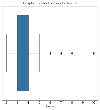
Finding Outliers.
def detect_outliers_iqr(df1):
    outlier_indices = {}

    columns_to_check = ['satisfaction_level', 'last_evaluation', 'number_project',
                        'average_monthly_hours', 'tenure']

    for column in columns_to_check:
        Q1 = df1[column].quantile(0.25)
        Q3 = df1[column].quantile(0.75)
        IQR = Q3 - Q1

        lower_bound = Q1 - 1.5 * IQR
        upper_bound = Q3 + 1.5 * IQR

        # Get indices of outliers
        outliers = df1[(df1[column] < lower_bound) | (df1[column] > upper_bound)].index
        outlier_indices[column] = list(outliers)

    return outlier_indices

# Get outliers for the specified columns
outliers_dict = detect_outliers_iqr(df1)

# Print the number of outliers per column
for col, outliers in outliers_dict.items():
    print(f"{col}: {len(outliers)} outliers")


plt.figure(figsize=(6,6))
plt.title('Boxplot to detect outliers for tenure', fontsize=12)
plt.xticks(fontsize=12)
plt.yticks(fontsize=12)
sns.boxplot(x=df1['tenure'])
plt.show()
satisfaction_level: 0 outliers
last_evaluation: 0 outliers
number_project: 0 outliers
average_monthly_hours: 0 outliers
tenure: 824 outliers
Visualizing Correlations
-
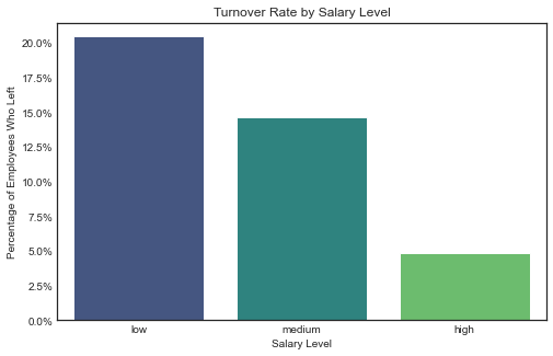
Salary despite not being a numerical variable, shows a strong correlation with turnover.
-
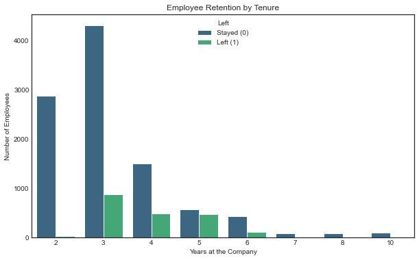
Years in the Company: Between 3 and 5 years, is when most employees leave the company. in percentage, at 4 years is the peak. but this may be due to different factors that we cannot infer from the data as it is, therefore not a good variable to build a predictive model.
-
Average Monthly Hours and Number of Projects have a strong correlation with satisfaction level but also and logically with each other, this can be problematic for some type of models
-
Satisfaction_level has the strongest correlation with left, the variable that we want to predict.
# Compute correlation matrix (excluding categorical variables)
corr_matrix = df1.drop(columns=['department', 'salary']).corr()

# Plot heatmap
plt.figure(figsize=(10, 6))
sns.heatmap(corr_matrix, annot=True, fmt=".2f", cmap='viridis', linewidths=0.5)

plt.title("Correlation Matrix")
plt.show()

# Calculate turnover percentage by salary
salary_retention = df1.groupby('salary')['left'].mean().reset_index()

# Sort by highest turnover rate
salary_retention = salary_retention.sort_values(by='left', ascending=False)

# Plot
plt.figure(figsize=(8, 5))
sns.barplot(data=salary_retention, x='salary', y='left', palette='viridis')

plt.title('Turnover Rate by Salary Level')
plt.xlabel('Salary Level')
plt.ylabel('Percentage of Employees Who Left')
plt.gca().yaxis.set_major_formatter(plt.matplotlib.ticker.PercentFormatter(1))  # Convert to percentage format
plt.show()


plt.figure(figsize=(8, 5))
sns.boxplot(data=df1, x='left', y='average_monthly_hours', palette='viridis')

plt.title('Average Monthly Hours vs Employee Retention')
plt.xlabel('Left Company (0 = Stayed, 1 = Left)')
plt.ylabel('Average Monthly Hours')
plt.show()
plt.figure(figsize=(10, 6))

# Create grouped bar plot
sns.countplot(data=df1, x='tenure', hue='left', palette='viridis')

# Labels and title
plt.xlabel("Years at the Company")
plt.ylabel("Number of Employees")
plt.title("Employee Retention by Tenure")
plt.legend(title="Left", labels=["Stayed (0)", "Left (1)"])
plt.show()
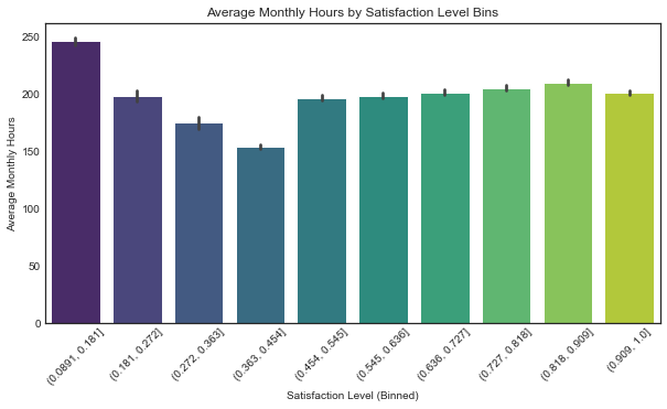
df2 = df1.copy() # Safe copy for EDA
df2["satisfaction_bin"] = pd.cut(df2["satisfaction_level"], bins=10) # 10 equal-width bins
plt.figure(figsize=(10, 5))
sns.barplot(data=df2, x="satisfaction_bin", y="average_monthly_hours", estimator=np.mean, palette="viridis")
plt.xticks(rotation=45)
plt.title("Average Monthly Hours by Satisfaction Level Bins")
plt.xlabel("Satisfaction Level (Binned)")
plt.ylabel("Average Monthly Hours")
plt.show()
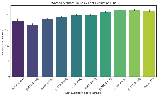
df2["evaluation_bin"] = pd.cut(df2["last_evaluation"], bins=10)
plt.figure(figsize=(10, 5))
sns.barplot(data=df2, x="evaluation_bin", y="average_monthly_hours", estimator=np.mean, palette="viridis")
plt.xticks(rotation=45)
plt.title("Average Monthly Hours by Last Evaluation Bins")
plt.xlabel("Last Evaluation Score (Binned)")
plt.ylabel("Average Monthly Hours")
plt.show()
Feature Engineering and Variable Selection
Encoding categorical variables:
-
Department: Target Encoding fits perfectly here because the churn rate varies significantly across departments, capturing hidden patterns and relationships with the target (left). Frequency Encoding could be helpful, but since the department distribution is imbalanced, it wouldn’t capture the impact on churn effectively.
-
Salary: Ordinal Encoding
Additional Correlation metrics
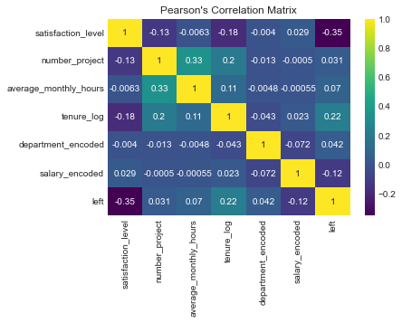
- Random Forest Classifier
- Pearson’s Correlation Matrix
The results from both methods are consistent. The key drivers of turnover are satisfaction_level, tenure_log, and average_monthly_hours. The low importance of salary and department suggests that internal work dynamics and personal satisfaction play a more significant role in predicting turnover.
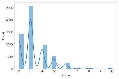
# Plot distribution of tenure,
sns.histplot(df1['tenure'], bins=20, kde=True)
plt.show()
df1['tenure'].skew()
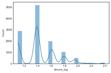
# log-transformed tenure
df1['tenure_log'] = np.log1p(df1['tenure'])
sns.histplot(df1['tenure_log'], bins=20, kde=True)
plt.show()
# 1. Target Encoding for 'department'
target_mean = df1.groupby('department')['left'].mean()
df1['department_encoded'] = df1['department'].map(target_mean)

# 2. Ordinal Encoding for 'salary'
salary_order = [['low', 'medium', 'high']]
ordinal_encoder = OrdinalEncoder(categories=salary_order)
df1['salary_encoded'] = ordinal_encoder.fit_transform(df1[['salary']])
df1['salary_encoded'] = df1['salary_encoded'].astype(int)
df1.head()
| satisfaction_level | last_evaluation | number_project | average_monthly_hours | tenure | work_accident | left | promotion_last_5years | department | salary | tenure_log | department_encoded | salary_encoded | |
|---|---|---|---|---|---|---|---|---|---|---|---|---|---|
| 0 | 0.38 | 0.53 | 2 | 157 | 3 | 0 | 1 | 0 | sales | low | 1.386294 | 0.169805 | 0 |
| 1 | 0.80 | 0.86 | 5 | 262 | 6 | 0 | 1 | 0 | sales | medium | 1.945910 | 0.169805 | 1 |
| 2 | 0.11 | 0.88 | 7 | 272 | 4 | 0 | 1 | 0 | sales | medium | 1.609438 | 0.169805 | 1 |
| 3 | 0.72 | 0.87 | 5 | 223 | 5 | 0 | 1 | 0 | sales | low | 1.791759 | 0.169805 | 0 |
| 4 | 0.37 | 0.52 | 2 | 159 | 3 | 0 | 1 | 0 | sales | low | 1.386294 | 0.169805 | 0 |
# Select features for the model
df_selected = df1[['satisfaction_level', 'number_project', 'average_monthly_hours',
                   'tenure_log',  'department_encoded',
                   'salary_encoded', 'left']]
df_selected.head()
| satisfaction_level | number_project | average_monthly_hours | tenure_log | department_encoded | salary_encoded | left | |
|---|---|---|---|---|---|---|---|
| 0 | 0.38 | 2 | 157 | 1.386294 | 0.169805 | 0 | 1 |
| 1 | 0.80 | 5 | 262 | 1.945910 | 0.169805 | 1 | 1 |
| 2 | 0.11 | 7 | 272 | 1.609438 | 0.169805 | 1 | 1 |
| 3 | 0.72 | 5 | 223 | 1.791759 | 0.169805 | 0 | 1 |
| 4 | 0.37 | 2 | 159 | 1.386294 | 0.169805 | 0 | 1 |
corr_matrix = df_selected.corr(method='pearson')
sns.heatmap(corr_matrix, annot=True, cmap='viridis')
plt.title("Pearson's Correlation Matrix")
plt.show()
X = df_selected.drop('left', axis=1)
y = df_selected['left']

model = RandomForestClassifier(random_state=42)
model.fit(X, y)

plt.figure(figsize=(10, 6))
feature_importance = pd.Series(model.feature_importances_, index=X.columns)
sorted_features = feature_importance.sort_values(ascending=True)

plt.barh(sorted_features.index, sorted_features.values, color='royalblue', height=0.7)
plt.xlabel("Feature Importance Score")
plt.ylabel("Features")
plt.title("Feature Importance (Random Forest)")
plt.show()
# Features and target
X = df_selected.drop(columns=['left'])
y = df_selected['left']

# Split the data (80% train, 20% test, stratified)
X_train, X_test, y_train, y_test = train_test_split(X, y, test_size=0.2, stratify=y, random_state=42)
Models
-
Logistic Regresion: Very low Precision(0.42) and F1-score(0.56) even afterscaling and increased iterations. suggesting is not the best model for prediction but might have interpretability value if explored further.
- Random Forest Excelent results in all metrics as well as cross-validation suggesting:
- Model is not overfitting.
- Performs consistently across different subsets of data.
- There’s no need to further balance the classes.
- XGBoost: Similar but slightly better results than Random Forest, as well as similar feature importance results.
# Define the pipeline with scaling and logistic regression (with class balancing)
pipeline = Pipeline([
    ('scaler', StandardScaler()),  # Step 1: Scale the data
    ('log_reg', LogisticRegression(class_weight='balanced', random_state=42, max_iter=500))  # Step 2: Train Logistic Regression
])

# Fit the pipeline on training data
pipeline.fit(X_train, y_train)

# Make predictions
y_pred = pipeline.predict(X_test)
y_prob = pipeline.predict_proba(X_test)[:, 1]  # Get probabilities for ROC curve
accuracy = accuracy_score(y_test, y_pred)
precision = precision_score(y_test, y_pred)
recall = recall_score(y_test, y_pred)
f1 = f1_score(y_test, y_pred)
auc = roc_auc_score(y_test, y_prob)

print(f'Accuracy: {accuracy:.3f}')
print(f'Precision: {precision:.3f}')
print(f'Recall: {recall:.3f}')
print(f'F1-score: {f1:.3f}')
print(f'AUC: {auc:.3f}')
Accuracy: 0.784
Precision: 0.424
Recall: 0.849
F1-score: 0.566
AUC: 0.840
rf = RandomForestClassifier(n_estimators=100, class_weight='balanced', random_state=42)
rf.fit(X_train, y_train)

y_pred_rf = rf.predict(X_test)
y_prob_rf = rf.predict_proba(X_test)[:, 1]  # For AUC

# Evaluate Random Forest
accuracy_rf = accuracy_score(y_test, y_pred_rf)
precision_rf = precision_score(y_test, y_pred_rf)
recall_rf = recall_score(y_test, y_pred_rf)
f1_rf = f1_score(y_test, y_pred_rf)
auc_rf = roc_auc_score(y_test, y_prob_rf)

print(f'\nRandom Forest Results:')
print(f'Accuracy: {accuracy_rf:.3f}')
print(f'Precision: {precision_rf:.3f}')
print(f'Recall: {recall_rf:.3f}')
print(f'F1-score: {f1_rf:.3f}')
print(f'AUC: {auc_rf:.3f}')
Random Forest Results:
Accuracy: 0.985
Precision: 0.976
Recall: 0.930
F1-score: 0.952
AUC: 0.979
# Initialize model
rf = RandomForestClassifier(n_estimators=100, random_state=42)

# Perform 5-fold cross-validation
cv_scores = cross_val_score(rf, X_train, y_train, cv=5, scoring='roc_auc')

# Print results
print(f"Cross-Validation AUC Scores: {cv_scores}")
print(f"Mean AUC: {cv_scores.mean():.3f}")
Cross-Validation AUC Scores: [0.9808366  0.97662911 0.97004029 0.98147897 0.9794219 ]
Mean AUC: 0.978
from xgboost import XGBClassifier

# Initialize XGBoost model with recommended settings
xgb = XGBClassifier(
    n_estimators=100,
    learning_rate=0.1,
    random_state=42,
    use_label_encoder=False,  # Avoid deprecation warning
    eval_metric="logloss"  # Restore default behavior from pre-1.3 versions
)

# Train the model
xgb.fit(X_train, y_train)

# Predictions
y_pred_xgb = xgb.predict(X_test)
y_prob_xgb = xgb.predict_proba(X_test)[:, 1]  # Probabilities for AUC

# Evaluate
print("XGBoost Results:")
print(classification_report(y_test, y_pred_xgb))
print(f"AUC: {roc_auc_score(y_test, y_prob_xgb):.3f}")
/Users/user/opt/anaconda3/lib/python3.9/site-packages/xgboost/data.py:250: FutureWarning: pandas.Int64Index is deprecated and will be removed from pandas in a future version. Use pandas.Index with the appropriate dtype instead.
  elif isinstance(data.columns, (pd.Int64Index, pd.RangeIndex)):


XGBoost Results:
              precision    recall  f1-score   support

           0       0.99      1.00      0.99      2001
           1       0.97      0.93      0.95       398

    accuracy                           0.98      2399
   macro avg       0.98      0.96      0.97      2399
weighted avg       0.98      0.98      0.98      2399

AUC: 0.985
# Get feature importance from trained XGBoost model
xgb_importance = xgb.feature_importances_

# Convert to a DataFrame for better visualization
importances_df = pd.DataFrame({'Feature': X_train.columns, 'Importance': xgb_importance})

# Sort by importance
importances_df = importances_df.sort_values(by='Importance', ascending=True)

plt.figure(figsize=(10, 6))
plt.barh(importances_df['Feature'], importances_df['Importance'], color='royalblue', height=0.7)
plt.xlabel('Feature Importance Score')
plt.ylabel('Features')
plt.title('XGBoost Feature Importance')
plt.show()
import joblib

# Save models
joblib.dump(rf, "random_forest_model.pkl")  # Random Forest model
joblib.dump(xgb, "xgboost_model.pkl")  # XGBoost model
['xgboost_model.pkl']